


A case for painting in another artist's style
Something to try on for size

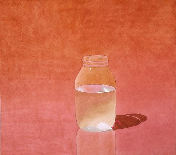
Do you have a random screenshot you always fall back on? Even in the black hole of artist references and 6 long years of baby pictures that flood my photo app, I have a decade-long obsession with a screenshot of a watercolor by artist Mark Adams, pictured above. I feel nothing short of “how did he do that?” kinda envy looking at it.
As we all know, artists are collectors of things: references, ideas, styles past-present-future, inspirations, napkin sketches, forgotten ideas and fleeting thoughts. I thought why not honor this long-term obsession with Mark Adams and paint in his style? You may think, “Thief! How could you steal somebody’s style?” But as Picasso said, “good artists borrow, but great artists steal.” This is an exercise in stepping into the shoes of the artist at hand. What choices did he make? How did he hold their brush? How did he strategize the process? By trying out this style, maybe I can learn something about my own self-taught techniques.
This one is for the process junkies. So here we go!
Step 1: Observation
Before you can try out an artist’s style, you first need to describe it. I jot down everything off the top of my head looking at Mark Adams’ style.
-Watercolor but not watercolor-y AKA no water spots or blooming
-No visual brush strokes
-Mostly symmetrical
-Controlled watercolor work AKA no wet-on-wet
-Monochromatic
-Photo realistic
-Highly contrasted
-Figurative
-Single-subject still life
-Smaller format: 11.75 x 15.25 in
Closely studying the list above, I take the variables and run them through my own personal taste/talent generator. My goal is to paint a highly-contrasted, single-subject monochromatic watercolor painting with little visible traces of it being a watercolor.
Step 2: Inspiration
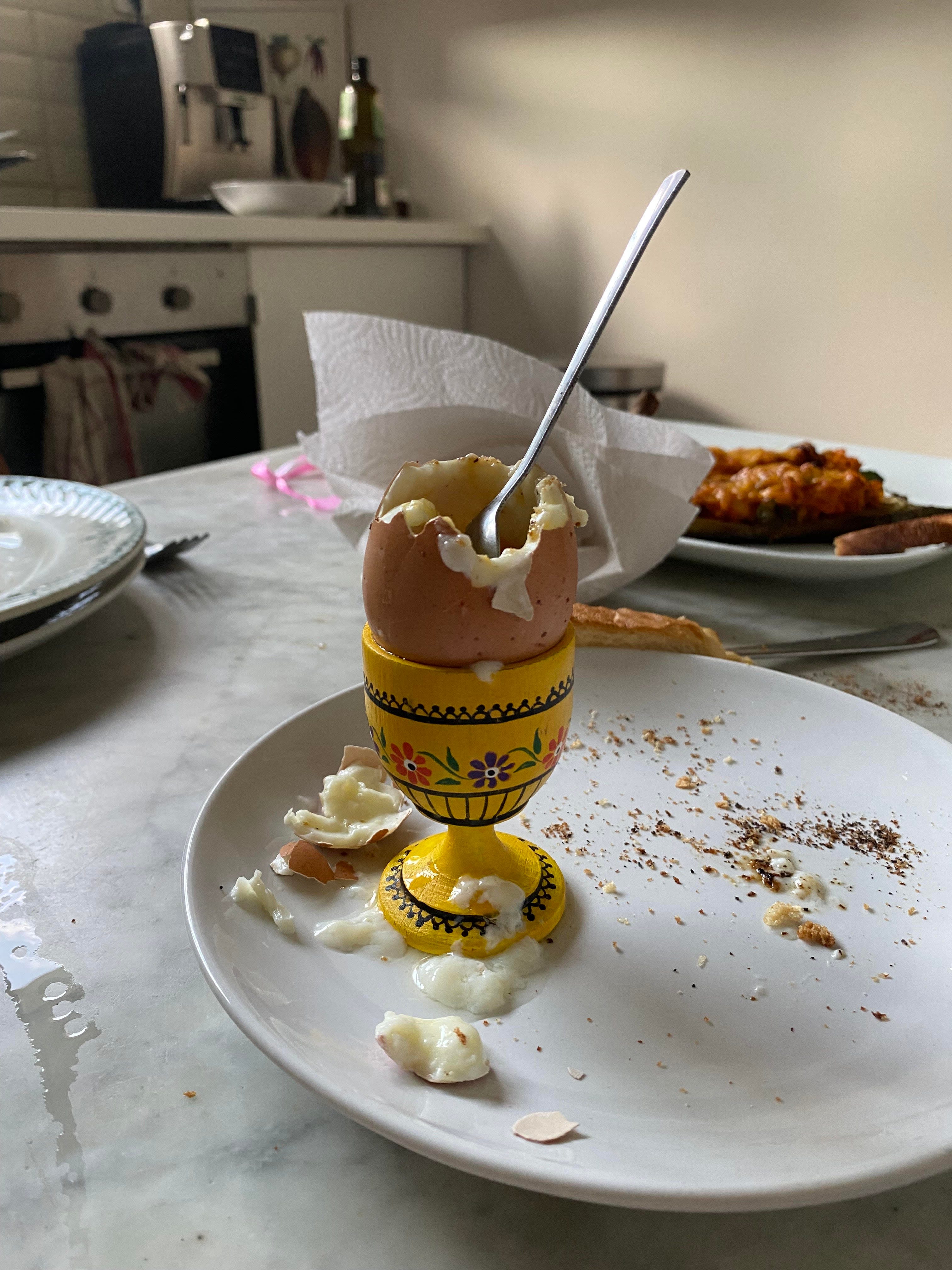
I snapped a picture of a half-eaten soft boiled egg to paint. The highly reflective spoon reminded me of how Adams communicates contrast through the play between light and dark.
Step 3: Layer 1
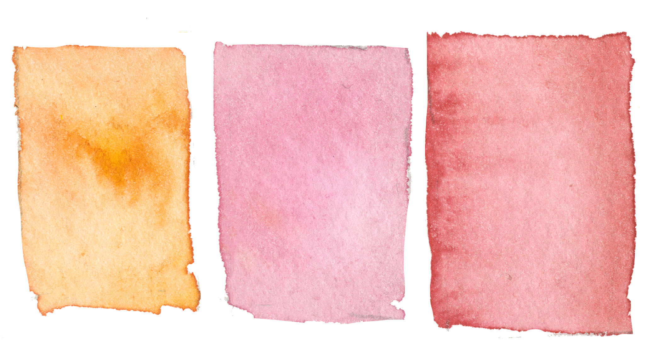
I’m challenging myself by working in a larger format than Adams. I pulled out a sheet of heavy-duty Arches watercolor paper (56 x 76cm 640g grain) which I’ve been saving for the right painting. Since my goal is to not have watercolor spots and a large plane of background color, I thought this thick, sturdy paper would hold the water and give me more time to paint each layer. Much like Adams, I keep my color palette limited like the one above.
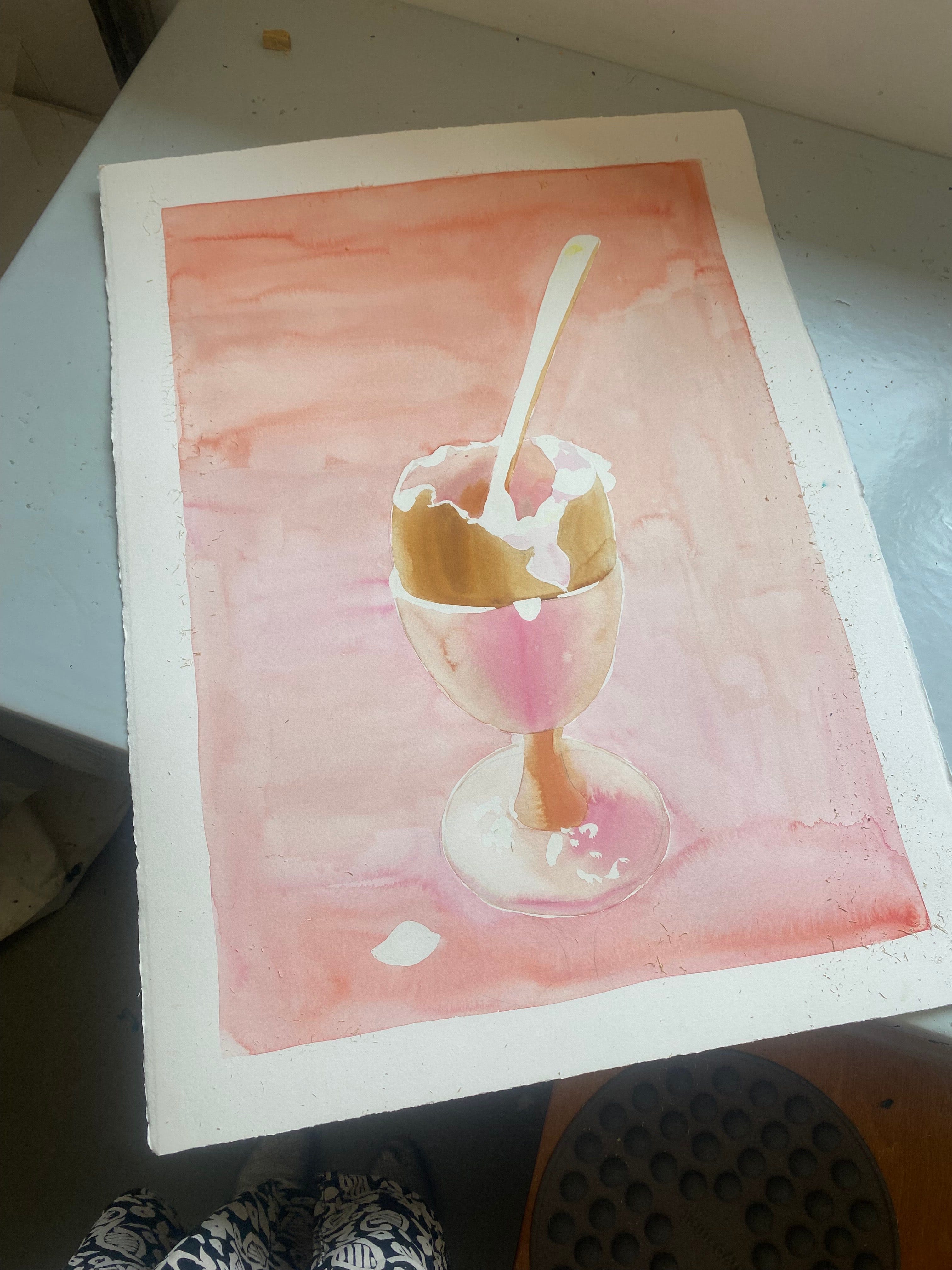
First I sketch out the composition with a 6H pencil. Because I need to render high contrast, I save-the-white-space© by masking the form of the spoon and edge of the egg with drawing gum. These are all the white shapes featured above. I want diffused color to represent the volume of the roundness of the egg and its cup, I apply the paint using the 50% flood technique. If you know my new book Thinking in Watercolor, you’ll know that this is when I lightly dampen the surface of the paper with a damp paintbrush. It should be an even layer of wetness that reflects the light but doesn’t drip all over the place. When I apply the color of my choosing, it will diffuse lightly on the wet paper mostly going where I want it to go.
Step 4: Layer 2
My goal is to paint a universally smooth background layer in one fell swoop. I cover the egg and egg cup watercolor layers with drawing gum once they are dry to protect the first layers. Because I’m painting in a much larger format, I pull out a 1-inch flat watercolor brush to assure I can cover the surface area quickly and evenly. A large round brush may apply too much water to the paper. I load up my paintbrush with pink and paint quickly from top to bottom until my background is completely covered, adding water progressively to achieve a lighter hue at the bottom of the paper. Much to my chargrin, I couldn’t stop adding more color to the wet background layer and it consequently resulted in some water spots.
Step 5: Final touches
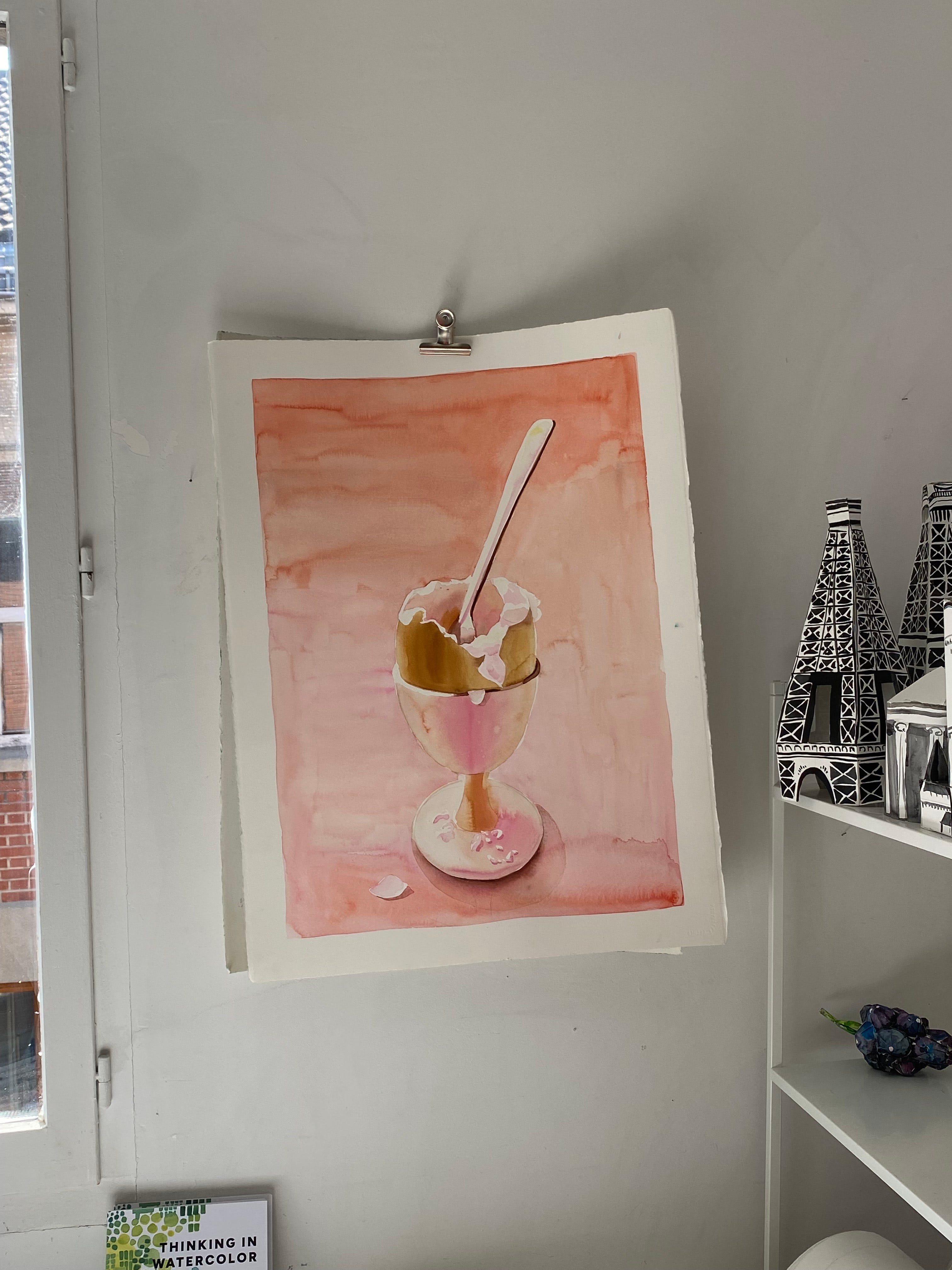
Once the background is completely dry, I rub off the drawing gum with my thumb. Lightness, especially the kind Mark Adams can render, can’t happen without contrast. I mix a warm dark grey and reinforce the right side of the spoon and the egg cup.
Step 6: Reflection
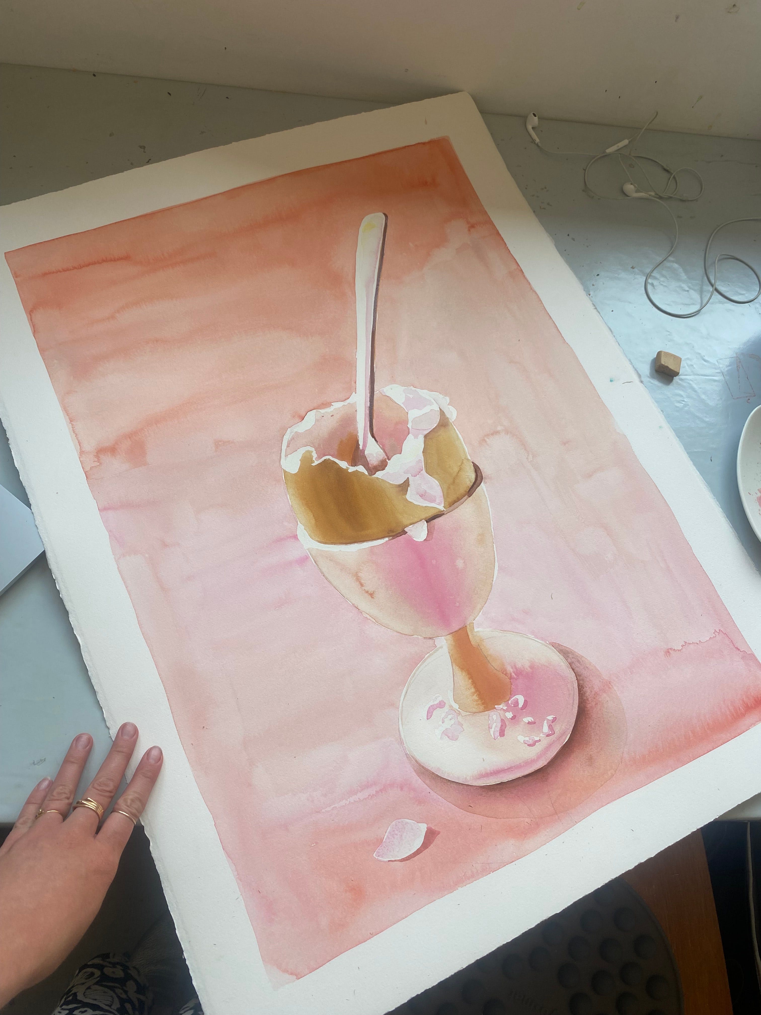
How did I do? And did I embarrass Mark Adams? As you can see, I haven’t mastered a Mark Adams-style watercolor just yet, but I’m troubleshooting all of the various techniques and supply challenges of painting in such a controlled style in a large format. I love the 3D effect I was able to achieve using 50% flood working with limited color palette. I still have some water spots which could be avoided by buying a much bigger flat brush and by mixing a large quantity of my desired color ahead of time to avoid scrambling at the last minute. I’m globally happy with this painting although I’m tempted to give it another shot and go for a smoother background.
I challenge you to give this a go from time to time, too.
Take care, dear reader. And don’t drink the watercolor water.
Some tidbits!
-Many more exercises in my new book Thinking in Watercolor.
-I’m going live again with
today at 8pm CET. We recently discussed watercolor and illustration, but this time is dedicated to comedy and drawing with humor. Catch it here.-Spots are filling up for my Paris Watercolor Retreat, November 10-14th. If you’ve ever wanted to dedicate yourself to mastering watercolor with Paris as a backdrop, drop me a line.
-Loved this brilliant illustrated article by Christoph Neimann. If you think AI is just a cool party trick, you should definitely read this. So much more is at risk.
So great and the color palette is lovely
Don't drink watercolor water! [The Best advice for artists] love it