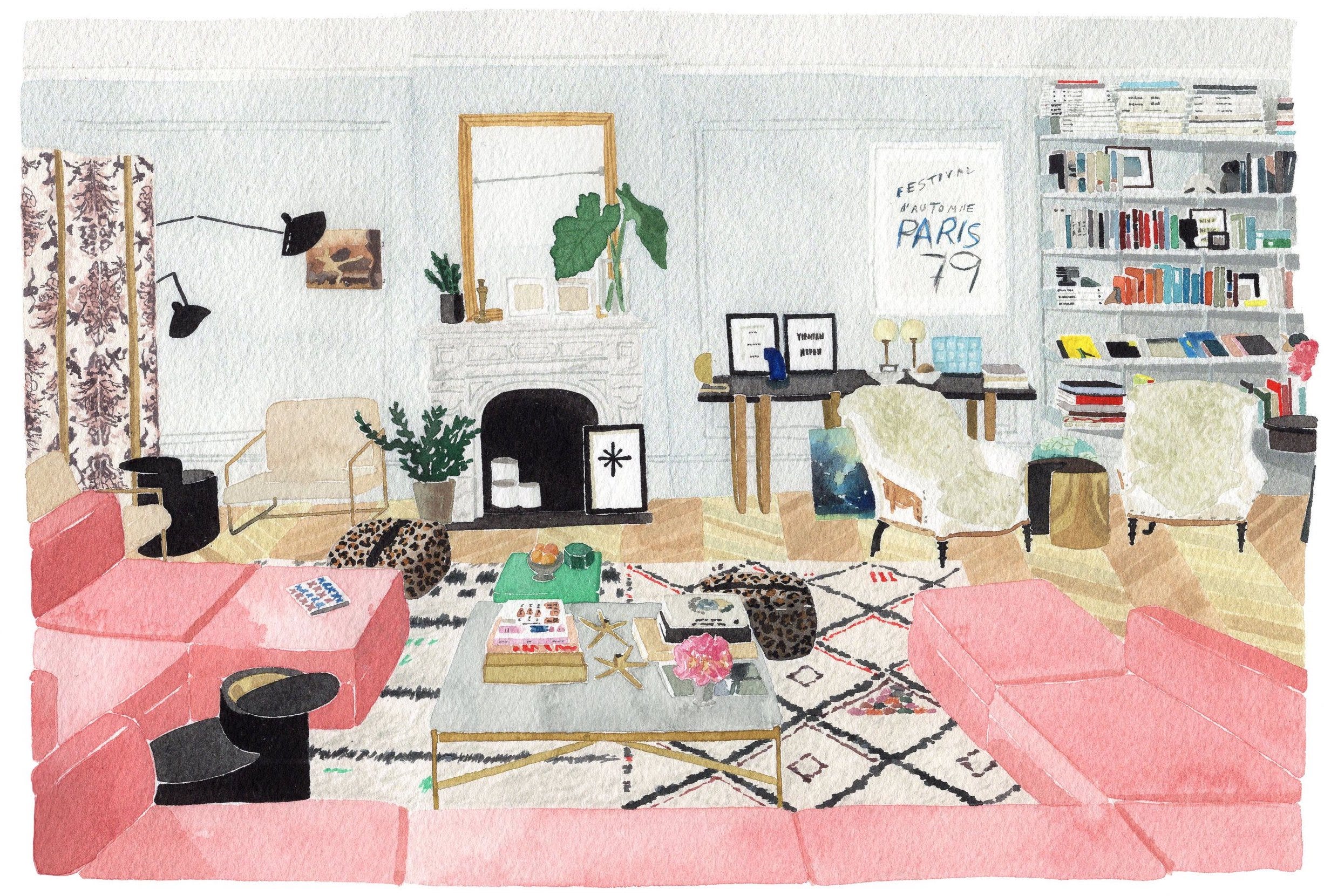
Today I have the pleasure of asking a few watercolor Qs to Paris-based friend Jane Black. Jane has worked as an in-house illustrator at Kate Spade New York and Rifle Paper Co. Her work has been featured in the most stunning Assouline coffee table books and Architectural Digest. Observe the richly rendered watercolor illustration above and you will understand immediately the bulletproof patience and precision of her work.
Jane spoke to my summer illustration course at The Paris College of Art last year and I was blown away with her technique which is completely different from my own. That’s the beauty of having fellow artist friends. The takeways are invaluable…The biggest revelation is how she renders shapes instead of relying on copious outlining which can flatten a watercolor. I’ll let Jane take it away from here…
Q: How do you build your watercolor? Does it start with a sketch? How do you achieve depth in your watercolors? Do you start light or dark?
A: I like to use watercolor in a more graphic style than loose and watery. I create shapes with individual colors, let the layer dry, and then layer on top of / or next to each other. I always start with a sketch for fine art, and try to erase the pencil as I go (I prefer to not see pencil marks, but it’s personal preference!). If I am painting something that will end up being digitally printed, I may wing it without a sketch, since it can always be lightly edited in the computer if needed.
I always work from light to dark, and would advise that for anyone practicing! It is really hard to go lighter once you’ve made an area dark, so you have to think through it a bit.
Q: How do you know if a watercolor is finished?
A: I am careful not to “overwork” a watercolor— too many layers can make it feel a bit muddy! Without realizing it (until now) I tend to keep to about three “layers” per object— a base layer, a “shadow” layer, and a details layer. This way, something feels both detailed and has depth. Remember to step back and look at your piece from time to time!
Q: Anything surprising in your kit? I remember you use both synthetic and natural brushes. And palette paper? Light board?
A: I buy a variety of brushes— both of synthetic and natural fibers— and like to play around with them. In my experience, natural brushes tend to be a bit looser/move around the paper more than synthetic. They also don’t need to be fancy, because they will wear out after awhile. I like tubes of paint, though a palette is easier for travel. I use palette paper (NDLR: a synthetic paper for watercolor mixing that can be dried and reactivated) instead of a regular plastic palette, because it tends to be easier to mix many different colors. I’ve recently discovered masking fluid, which is great if you want to leave an area of paper untouched. You paint the desired area with masking fluid, let it dry, and paint a watercolor layer over it. Once that is dry, you erase the masking fluid and are left with nice, crisp white areas. I also use a light board— if you are painting with white, you can turn it on and see the silhouette where you are painting. It is also great to lay a sketch below watercolor paper so that you don’t have to sketch directly on the watercolor paper.
Q: Any tips on how to control watercolor and get it to do what you want?
A: I work on control with the amount of water and type of brush that I use. A stiffer brush will allow you to control the shape on the page, and the amount of water will control how washy or bold the color is. The best thing you can do is practice! Experiment blending two colors on the page, using water to lighten them on the paper, layering on top of dry layers, etc! You will discover what type of effect you like best.
Thank you Jane for the insights into your watercolor practise. Be a pal and follow Jane on Instagram.
Comments
No posts