

Living the Still Life
Living the Still Life
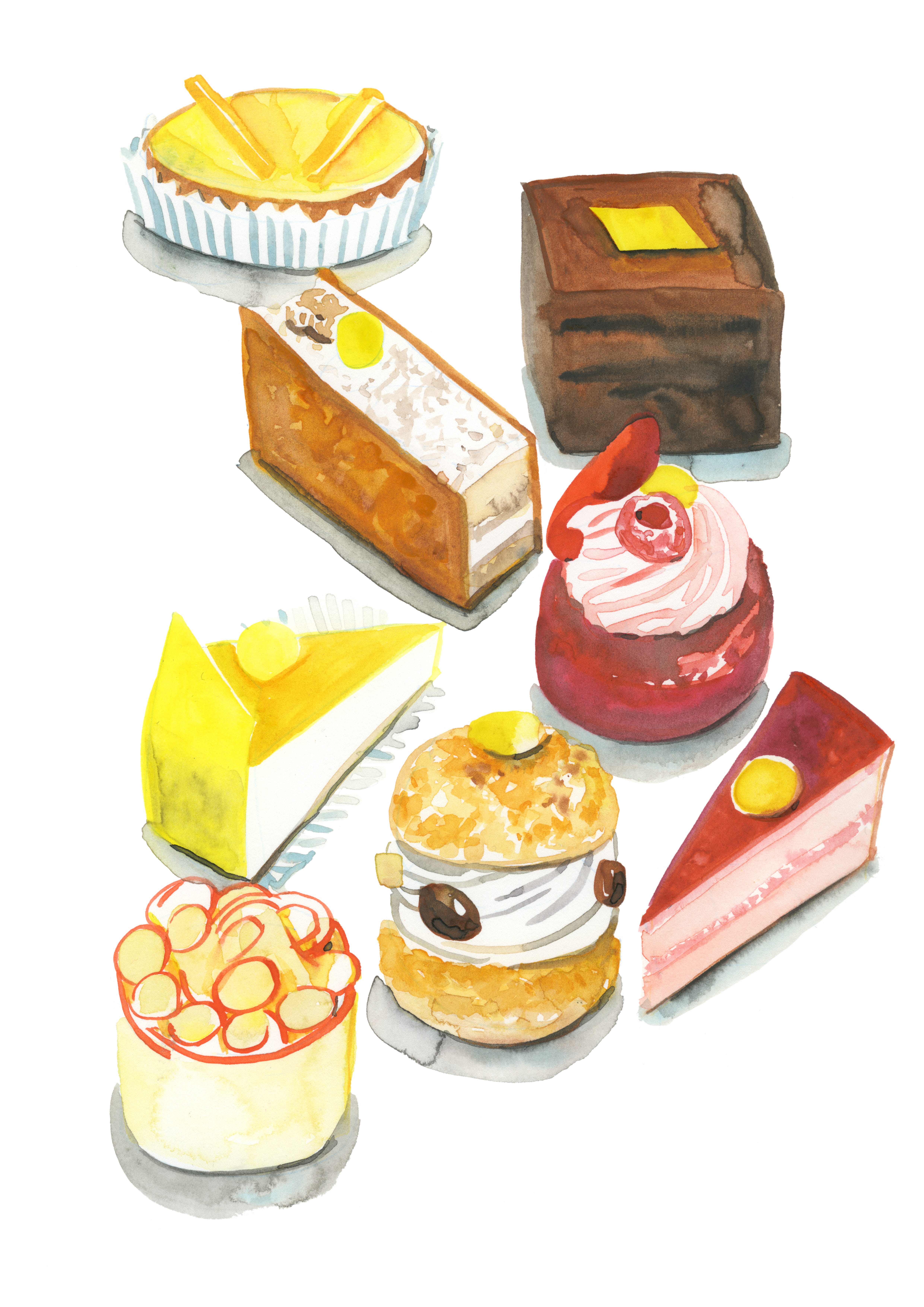
PART 6: How to Love Watercolor

I recently gave my students an assignment to create a New Yorker-style cover inspired by the realities of their lives in Paris. As I was thumbing through their concept drafts (many had TikTok as a framing device…eeek), a student with limited observational drawing skills whipped out an elaborate sketch of a dreamy Parisian cityscape. “Where did that come from?” I asked in shock. “I prefer drawing from a photo. I’m not good at observational drawings,” she chimed in. Yes, drawing from a photo is technically easier. It doesn’t move. You can pick it up and revisit it at any time. You can erase and redo to an oblivion. Or you can straight-up copy the image on a light board. I am not above this because I use reference photos, too. But to get better at real drawing, you have to put in the time of drawing from life.
Observational drawing forces you to be in the present to capture what you can and trust the process. You may need to make executive decisions about what to scrap or what to highlight. You have to remove all distractions and embrace the present. Your goal isn’t to recreate the marks that you see, but about evaluating and engaging with something in your world.
When I was scratching my head trying to find the first watercolor exercise to give you to wrap up this series on watercolor 101, why not start simply with your own world. It will cultivate your skills and jump-start the process of finding your own voice. Don’t copy what I am doing. Find your own angle; it’s more interesting.
Today’s Assignment!
Take out three different items from your home. Something living (fruit, vegetable, flower), something contrasting (an object of a different form or with a different texture) and something transparent. Group them together where they touch and make an interesting composition.
Step 1 / Observe
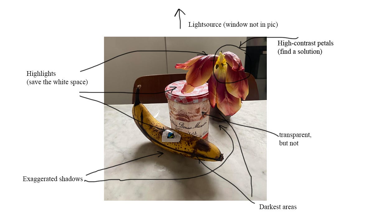
Before you begin, take a good 2-3 minutes to really study what is in front of you. Ask yourself the following questions:
Where is the light source coming from? What are the lightest and darkest portions of the skill life?
What are the darkest and most saturated colors? What are the lightest, least saturated colors?
How would you describe the textures of each object? Which watercolor techniques would best suit representing them? See the high contrast in the tulip petal.
Which object is closest to you?
Step 2 / Sketch
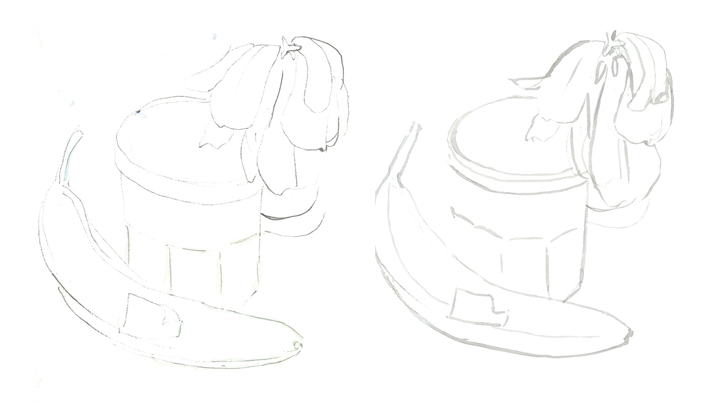
Sketch out the still life loosely lightly with an H pencil studying where each object touches as you see on the left. Go back with your pencil and note where the light is reflected on the surface of each and mark off the white space you will save for later on.
I mix a light grey wash which I paint on the sketch on the right to verify all the information. This is not to give the composition a crazy outline, it’s just to be more definitive about the forms I’ve rendered before I start building the color. Notice how my line has various widths and intensities which can suggest shadow and contrast with one simple wash.
Step 3/ Paint layers 1-2
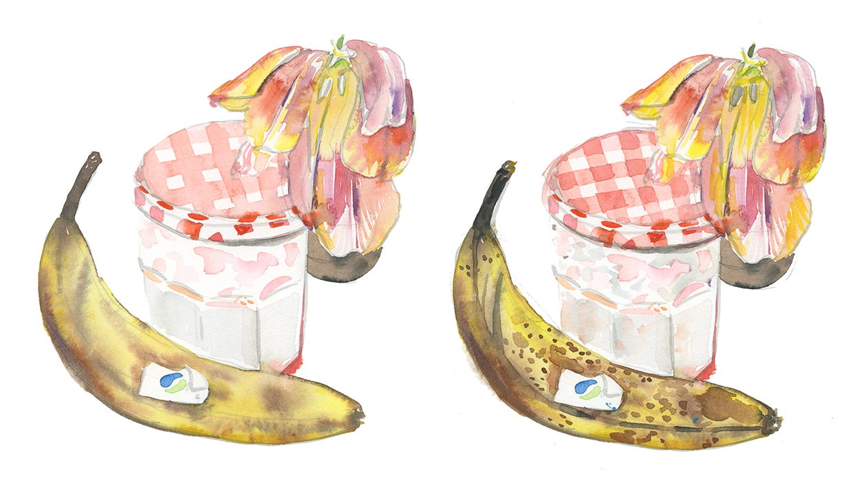
To the left: You may have been taught to build light layers in watercolor and not be bold. Since the banana is a bright yellow, I’m not going to waste time building layer after layer. I go directly with a highly saturated yellow wash wet-on-dry. Since the banana is of a certain age, I build the large brown spots by painting darker brown and black dry-on-wet while the first layer is still damp, noticing how it bleeds on the surface.
On the jam jar, I paint a light grey wash wet-on-dry to suggest the flat sides on the containter. Since the top of the jar reflects the light from the window above it, I paint the gingham texture with a light 10% red wash wet on a dry and with a highly saturated red on the sides to create constrast. I suggest the jam in the jar with a few dabs of pink wash within.
The tulip is going to be complicated because it is high-constrast with many different colors. This is where I’m going to use 50% flood. I paint the surface of the first petal with yellow wash (being sure to save the white space of the reflection). While the layer is lightly wet, I drop in more color. Each petal is different so I really observe each time how I can adapt my colors and their intensity accordingly. Let dry completely.
To the right: The second layer is about reinforcing color and adding more precise details. As you can see, I painted sugar spots and the black bits on the banana wet-on-dry. I added more contrast to the ginham pattern. And I continued building contrast on the tulip petals. Dry.
Step 4 / Final touches

The final layer is all about crossing the t’s and dotting the i’s. I paint a few more saturated brushstrokes on the flower to make it pop. I add the script on the jam jar. And because these aren’t objects floating in outerspace, I paint the exaggerated shadows beneath the still life to give it a sense of weight.
Conclusion
How did I do? This was a challenging watercolor because all three of these objects were in a state of decay. Don’t compare your final watercolor to an image of the still life because it’s not about photorealistic reproduction. How does it fair on it’s own? Were you able to control the intensity of your colors? How about your water control?
Too much water? Load up your brush with the amount of paint you want, then dab it off lightly on a paper towel or piece of scratch paper. Or use a smaller brush which will absorb less water.
Too little water? Use a bigger brush and add more water to your colors. Feel free to mix on a large palette to assure you are mixing enough of the right color before you commit.
Keep on trekking on, dear reader. And don’t drink the watercolor water.
Be sure to catch the last week of my digital exhibition “Paris I Suppose” at the Un Jour Une Illustration gallery here.