


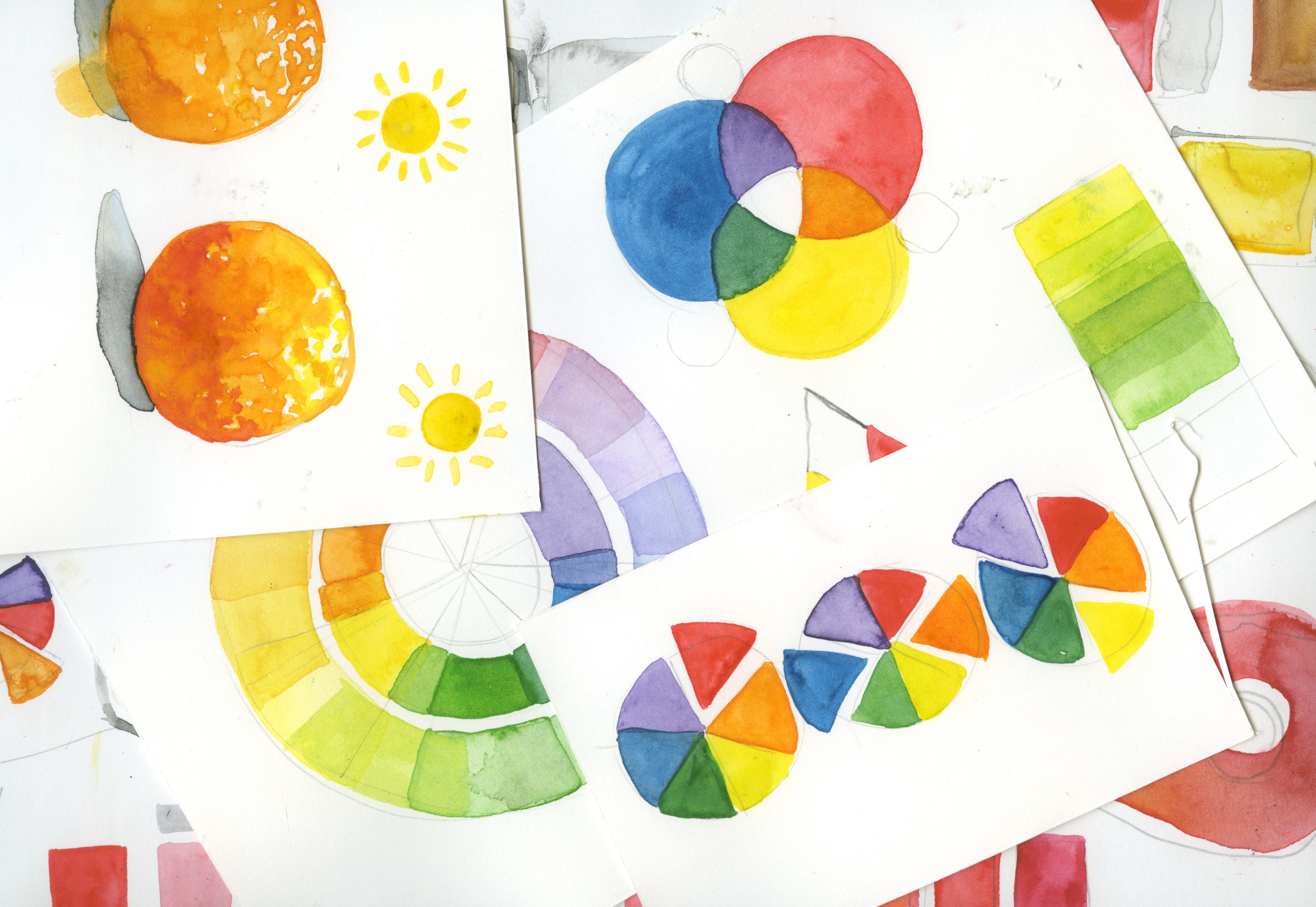
Mixing Colors 101
Mixing Colors 101
PART 3 How to Love Watercolor

Last week, we played with transparency in watercolor to get you understanding how the color can be dosed out strategically and hopefully get the results you want. Although you can approach watercolor like color by number putting the hues direct from your kit, you will be left with a flat, one-note painting without leaning into the magic of the transparency of watercolor. Today we will delve into the simple principles of color mixing with a little bit of theory sprinkled in.
Paint from life.
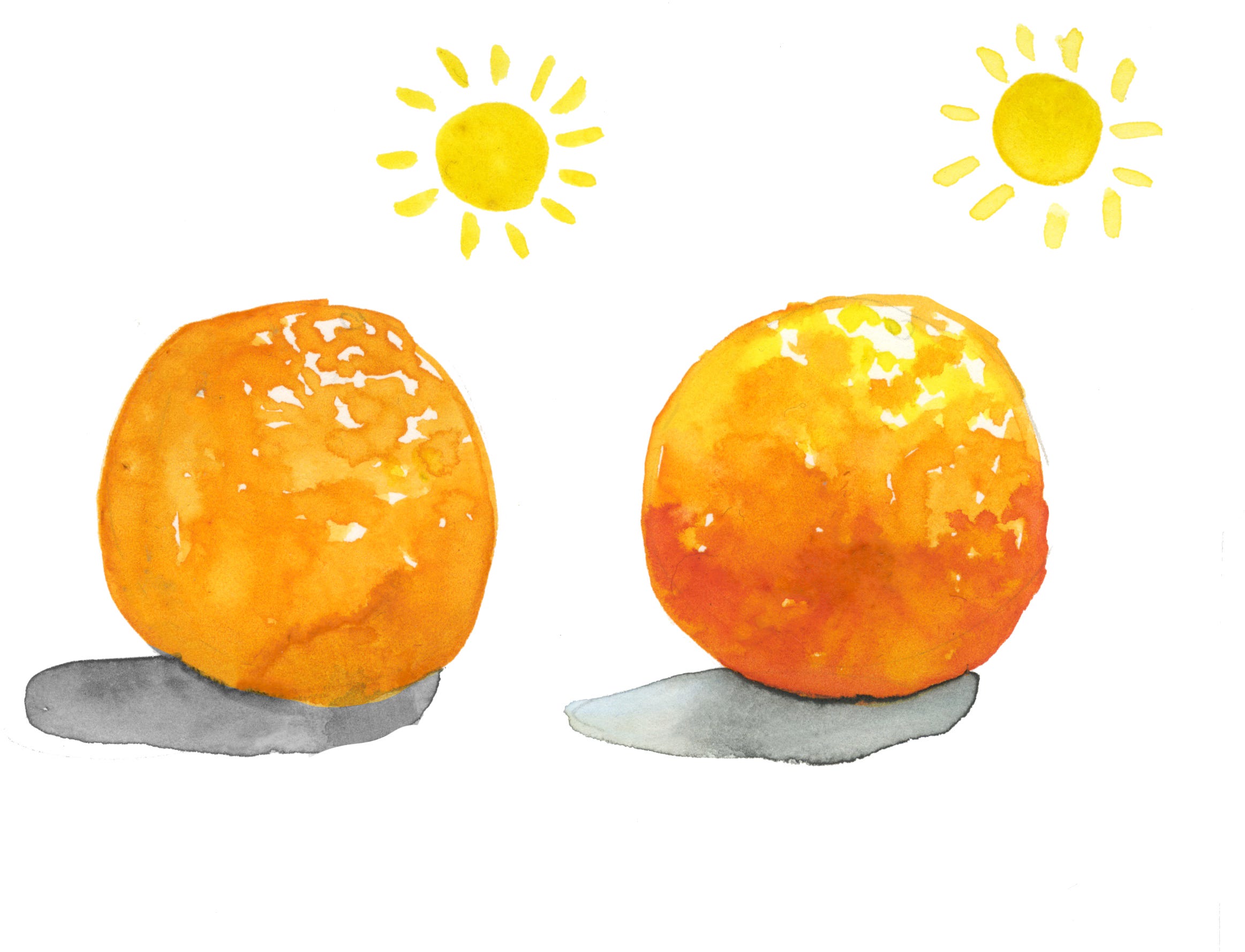
Much like anything else related to a long-term art practice, before you can break the rules, you first need to learn the basics by drawing/painting from life first. All art students are bombarded with still life observational drawings; it’s a right of passage. It’s surprising how many students find it so much easier to draw from a photo versus real life. It’s completely different and I can easily spot out what was done from life versus an iphone pic. Recreate what you see because you have to adapt to the nuances of not relying on what you think something looks like. This applies to color as well. See the orange above. I can say an orange is indeed orange, but when I look closely at a real one, I note how the peel is more yellower the closer it is to the light source and redder the closer it is to the shadow underneath. I like to say that when you are drawing from life, you have the luxury of having the primary reference in front of you. All the information is there, but take the time to really study it.
Color vocabulary
These are terms that I use in my own personal practice. The better you can identify and describe color, the better handle you will have when painting with watercolor. If you use Photoshop or any photo editing software, you are probably already aware of these.
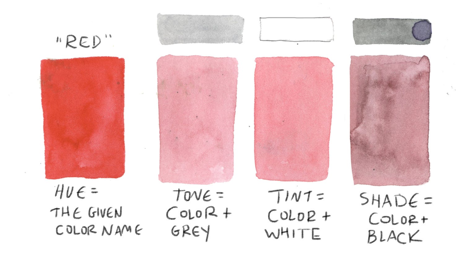
Hue is the given name to a color : red, green, etc.
Tone the version of a color when grey is added.
Tint is when the white watercolor is added to create more brightness.
Shade is when black is added to create a darker hue.
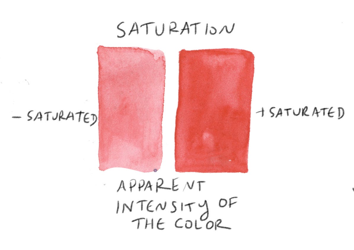
Saturation refers to the apparent intensity of the color.
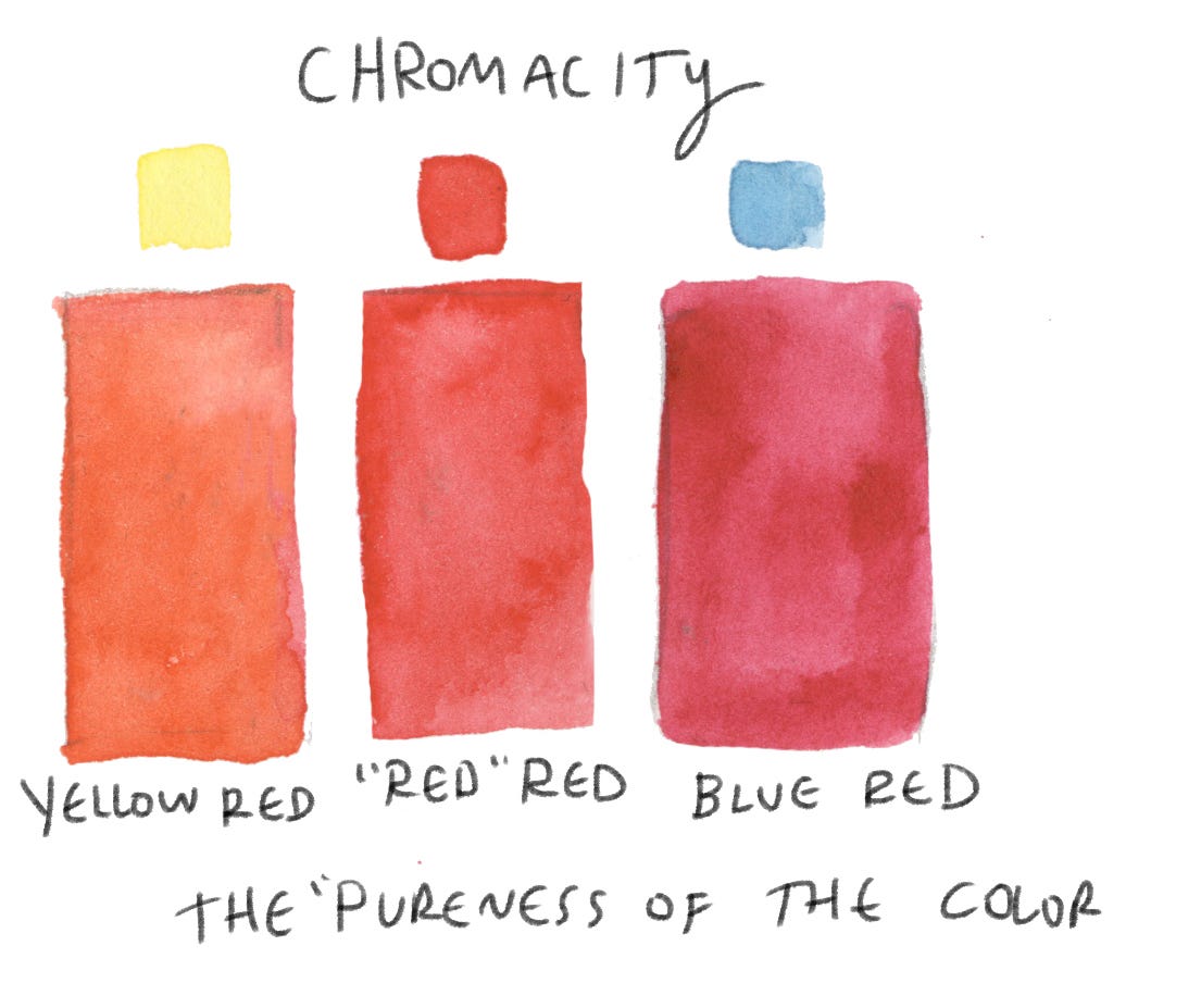
Chromaticity is the relative pureness of a color. Is it a pure red, yellow or blue to be considered a primary color?

Value is when the measure of lightness or darkness when the hue is constant.
Do you have a piece of art hanging in your home? Really study it and ask yourself how you can describe all the terms above adapted to the work. Describe the colors in relation to the list of terms above. How do the colors individually or collectively express emotion?
Color 101
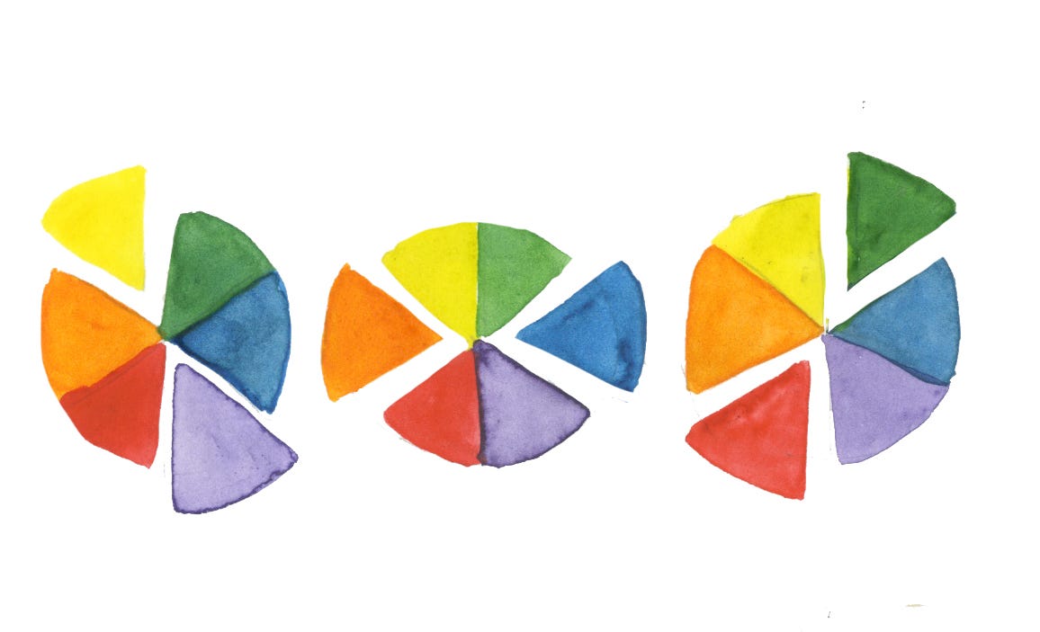
Like most artistic practices, the best way to learn to by doing. Today you will create colors wheels to better understand what you are working with. Why on god’s green Earth are you making me paint color wheels? Color wheels cue you in on how to adapt a color to get the one that you want while also understanding your pigments.
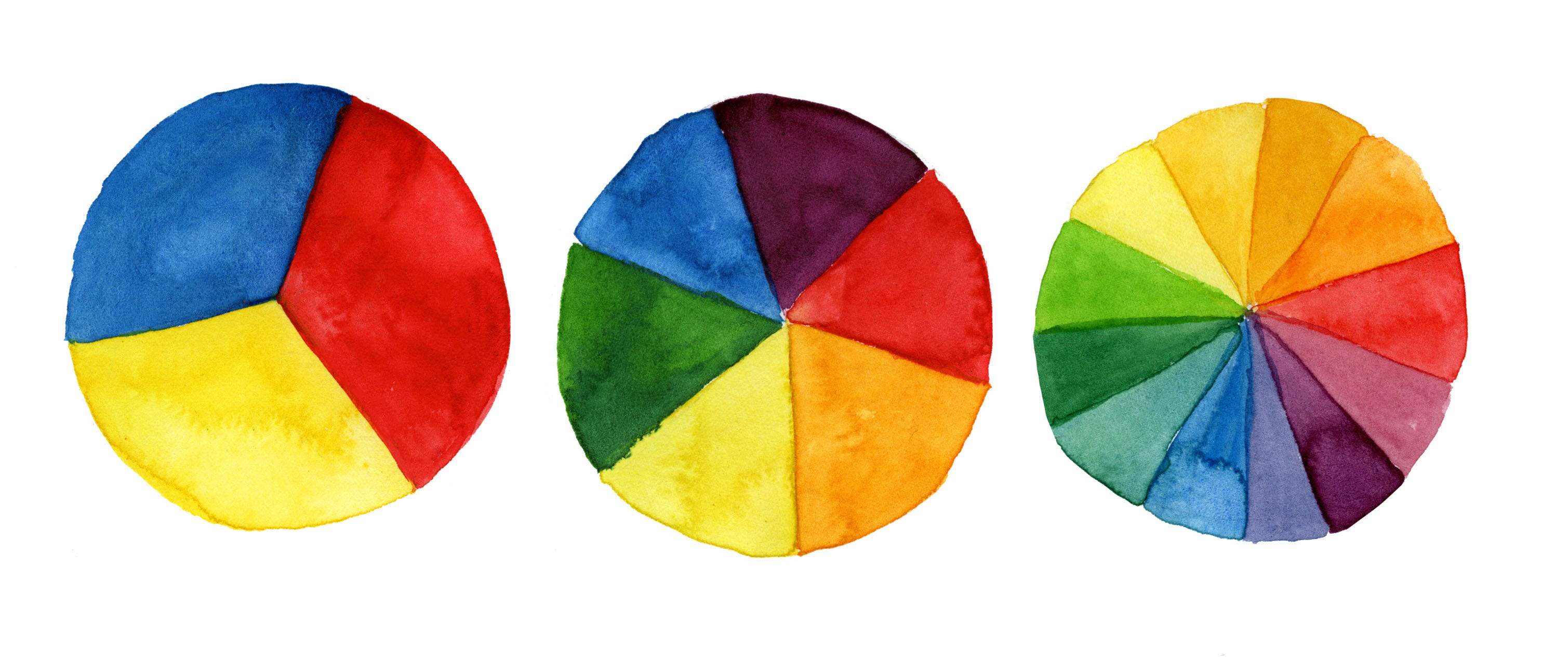
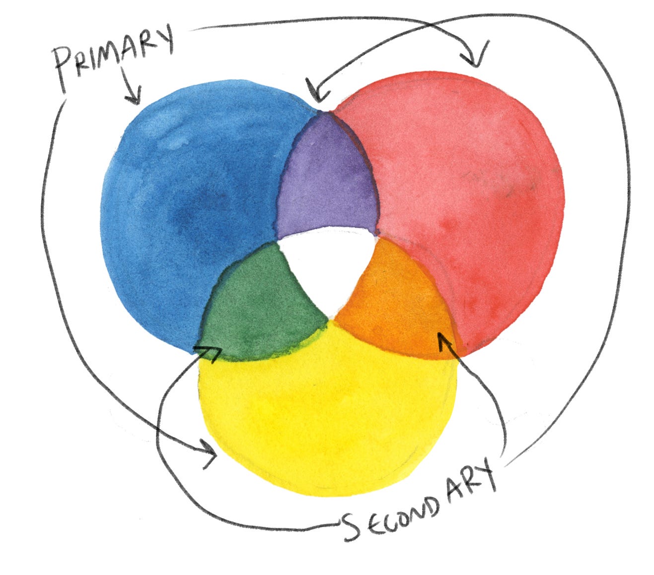
Primary colors are the Mercedes-Benz of colors: red, blue and yellow. All colors can be derived from these three.
Secondary colors occur when you break your color wheel into 6 parts and mix the colors connecting on the wheel. These include purple, green and orange.
Tertiary colors break the wheel into 12 pieces and mix the secondary and primary colors to make blue-green, yellow-green etc.
Sketch out these three wheels on watercolor paper and try this out for yourself, waiting for each layer to dry before adding the next. If you’ve done the exercise correctly, your eye should travel around flawlessly around the wheel.
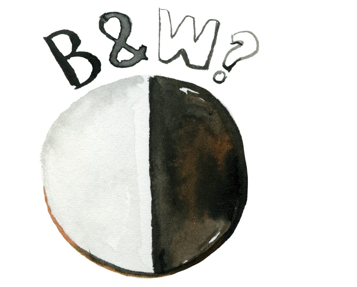
What about black and white? Black is the absence of color. This is why you shouldn’t wear black during a heat wave because it doesn’t reflect, but absorb sunlight. It can be added to create a darker version of a color. And the white watercolor? What does that do? Much like adding water to dull a color, it can be used to create a lighter version of the color. However since white adds more pigment, it can dull the intensity of the color and paint the page more opaquely.
A few color theory principles to put on your internal hard drive AKA put to memory
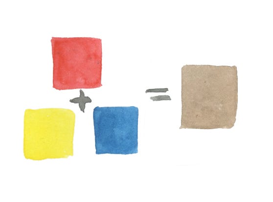
All the primary colors mixed together make brown. That’s why it’s important to keep your kit and palette as clean as possible to avoid the dreaded mud puddle when you don’t practice good watercolor hygiene.
Complimentary colors. Another way to make brown is to mix a primary color with the secondary color on the opposite side of the wheel: yellow and purple, red and green and blue and orange. Think LA Lakers, Christmas colors and Chicago Bears. The compliment can also be added to create a less intense version of a hue. For example, if your red is too red, add a tiny bit of green to create a darker version.
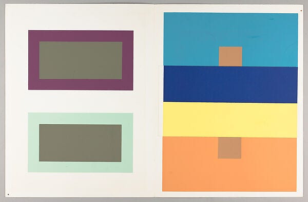
Josef Albers “The Interaction of Color” Interaction of color. Do you know the work of artist and color theorist Josef Albers? He came up with a theory that when colors are assembled together, their inherent intensities can change. Note in the example on the right above. There are two brown squares of different intensities in saturation. Are they the same color ot two different colors? If you remove the yellow and blue stripes from the middle, you will see that they are indeed the same. But color can greatly change depending on the other colors surrounding it. If you are interested in taking your color studies one step further, you cam take the color class here.
The work never ends. I feel like understanding color is a lifelong pursuit. When I see something I find beautiful (a sunset, a painting in a museum, cinematography etc), I really ask myself what is going on with the colors. I recently saw the Rothko retrospective at the Foundation Louis Vuitton. Rothko said something along the lines of "I don't paint color, I paint the light." I deeply pondered (I’m a dork) Rothko’s color choices, trying to understand the intensities of his colors and the resulting energy they revealed. I don’t have a sweeping conclusion. An artist is always working. My hope is that you will identify and appreciate color more deeply no matter what the context may be.

Stay inspired and don’t drink the watercolor water. I’ve tried it and the high was not great. -jkw
P.S. Don’t miss my digital show at Un Jour Une Illustration. My original watercolors can be seen at the gallery as well as a limited edition of prints.