


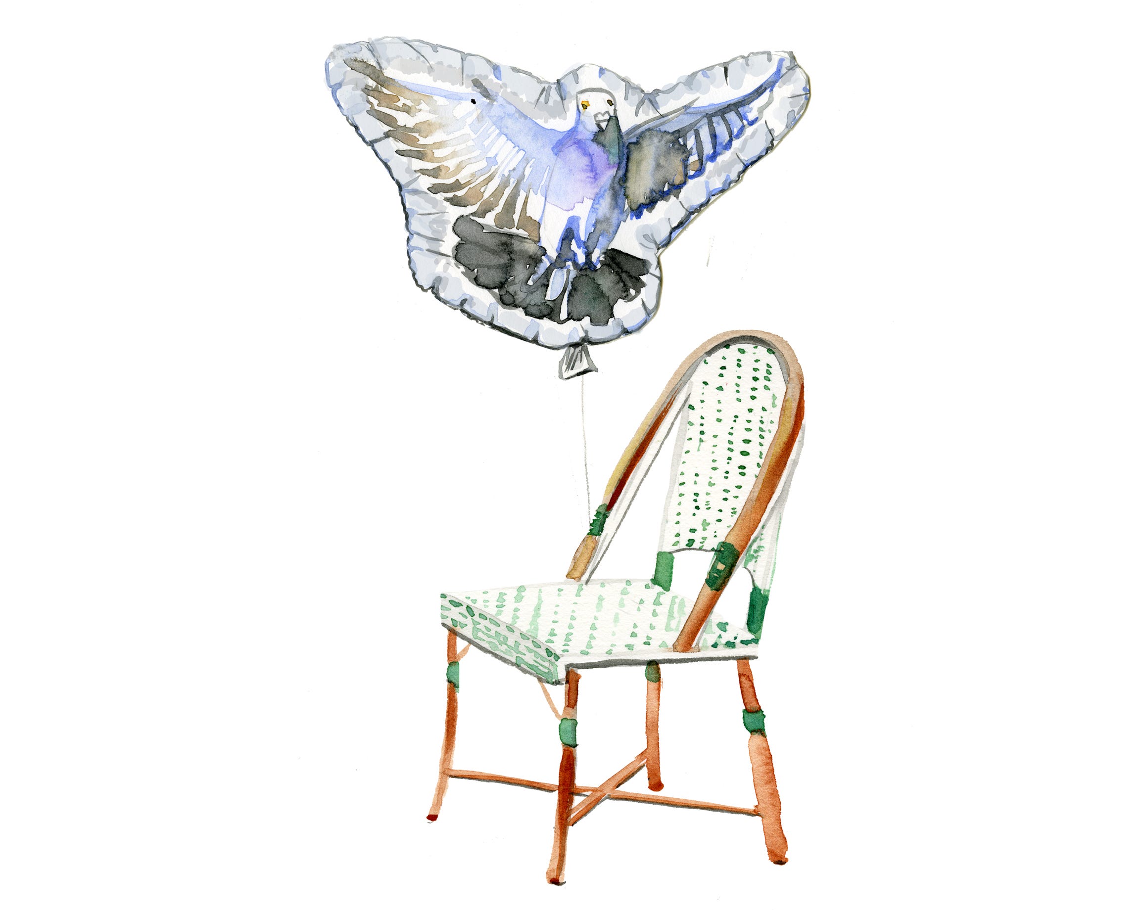
From Chicken Scratch Sketch to Watercolor Illustration
From Chicken Scratch Sketch to Watercolor Illustration
A Pigeon's Target Practice

I always think about the early days when I could copy an existing image like nobody’s business, but couldn’t think of an original idea. During a failed attempt at getting my master’s degree in costume design, my advisor (a brassy broad who was way too proud of the affair she had with Andre the Giant) told me “Jessie, you’re a serial copyist”. OUCH! Looking back at the sketches I made for an imaginary steampunk rendition of Into the Woods, I could research and merge existing concepts together in my sketches (little red riding hood was one part ‘90s Galliano and another part Wednesday Adams), but I was far from real Creation and making Real Work. I couldn’t tell at the time, but I was on the long road to finding my voice. And that is totally OK.
It may seem rudimentary, but every now and then I ask my students “what is an illustration”? It’s a piece of artwork that has a purpose beyond the walls of a gallery or museum or home studio. It usually has at least two parties involved in its conception (i.e. the illustrator and the art director/client/brand). It can be featured on products, book covers or perfume bottles. It could visualize a complex idea on the pages of a magazine, something that photography can’t always do. When I started whipping up watercolor paintings to illustrate my blog back in 2011, it was the catalyst to really start making work that had a clear POV because I was dissecting a text to find a visual solution. To start making drawings that aren’t just academic still lives, I like to always frame three specific variables when dreaming up an illustration: the client, the emotion/conflict/idea and the existing imagery (more on that later). This helps to eliminate the infinite possibilities of everything I could draw and start helping me find a real concept.
This isn’t a skill that’s developed overnight. But today I’m going to flesh out a cover idea I pitched to the New Yorker and how I trusted the creation process to take me there.


Step 1: Sketch
Like many Parisians, the Olympics were looming heavy this past year. For me, it was the perfect mashup of high and low. My initial idea on the left was a pigeon on a perch overlooking the opening ceremony. Before I took it to the drawing board, I flesh out my illustration holy trinity:
The Client: The New Yorker (demographic: coastal elites, cultivated and well-read )
Emotion/conflict/idea: Parisian pigeon getting revenge on the Olympics
Existing imagery: Notre Dame, Olympic rings, flags of the world, pigeon, Opening ceremony on the Seine
When I started sketching the many flags of the world and Olympic propaganda on the right, I thought what if it’s a true Parisian pigeon who wants nothing to do with the festivities? The Olympic rings became targets for the pigeon’s “revenge”. The first sketch is perfectly nice, but the second tells more of a story.
Step 2: Color Sketch
A lot of young artists think you can just sit down and turn out a masterpiece. But for me to this day, there’s lot of trial, error and tests. Something that I do when developing a sketch is to print out a few photocopies and paint directly on them to be sure of what I’m doing before I move onto watercolor paper. See the many variations above using a limited color palette which can drastically change the tone and emotion of the concept. Red is too Red Scare. Complementary colors take it to the North Pole. Since I’m painting the targets red, it can dominate the composition. So I need to continue exploring.
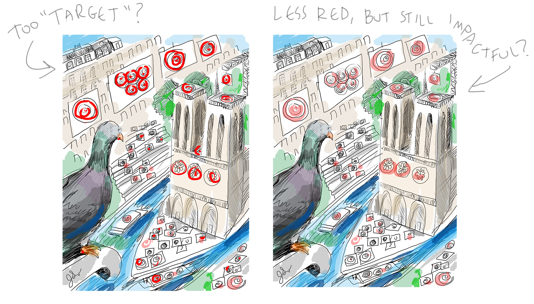
Something else revealed from this test is “do these targets looks like the bigbox store Target just opened in Paris?” Is this distracting? If so, would pink be a better option like in the image on the right? Since the pigeon is closest to us, he will be more detailed than the Parisian scene behind. The winner is the version on the right. Of course watercolor has a mind of its own and I can’t rely on recreating this exactly, but at least I have the concept and color story set in place.
Step 3: Paint
I sketch out my composition on watercolor paper using an HB pencil. And then I start building my layers little by little.
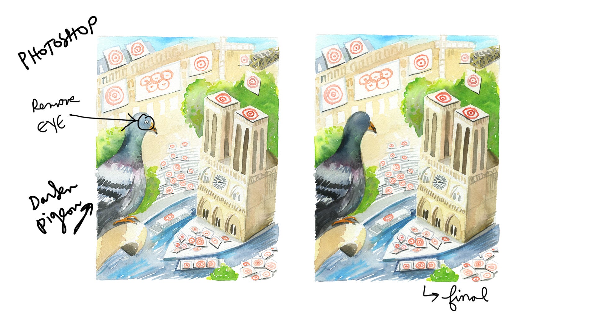
I scanned the final version. The eye of the pigeon makes him a little too earnest so I removed it in Photoshop. I also wanted to give him a more sinister edge so I darkened his body so it looks backlit.
Step 4: Reflect
How did this turn out? I like the overall concept and the colors are balanced. At first glance, we get the intense gaze between the pigeon and Notre Dame. And the copious amounts of targets suggest another level of meaning.
The New Yorker sadly declined on this cover idea, but fleshing this out was a great exercise in working intentionally and strategically to flesh out a decent portfolio piece. Once again, when you know who your work is for, it helps to eliminate the infinite amount of options. Give this a try.To recap, sketch as much as you need to. And think about color in the sketch phase.
Was this helpful? If so, please leave a comment below and let me know why. Curious to know more about the creative process? Ask a question down below and I’ll address in an upcoming newsletter.
If you appreciated this post, please preorder my forthcoming book Thinking in Watercolor.
Take care, dear reader. And don’t drink the watercolor water. -jkw
Excited about the book!
Very helpful! Particularly your language in describing the three variables to creating a piece, and the different questions to ask / elements to consider. Thanks! Exciting news about your book also! I say ugh to the New Yorker.